LANGUIFY
An English language learning site empowering India’s students to excel in school and work
PROJECT TYPE // UX Design, Information Architecture (IA), Desktop Web
TEAM // Team Project (3 designers)
DURATION // 5 weeks
TOOLS // Figma
↓

The Problem
Users find the site unintuitive and don’t keep up with regular practice
Languify’s students are unable to:
Understand their practice results and scores
What they should be doing next to continue improving their English
The Solution
Streamline the site and make it easy for users to know what to do next
This project called for rearchitecting the site map and adding features to help users navigate the site and understand the purpose of each page.
The Business Need
Build an intuitive experience to grow the user base
Languify wants users to build a habit practicing English and improve user retention. Having a strong baseline allows them to focus on growth.
The Constraints
India is a mobile-first country but Languify’s student users work on laptops
Android-friendly screens
Desktop mocks
Use placeholders in lieu of final content and copy

The Research
Synthesize Languify’s existing research and user feedback
Pre-existing user feedback and data indicate users have a hard time understanding what to do on the site.
My team fleshed out the research with a competitor analysis and heuristic evaluation. I focused on synthesizing the insights and identified the top pain points:
Users need digestable data. Technical terms and jargon are not user-friendly and need explanation.
Dead-ends and broken experiences scattered throughout the site does not instill user trust in the product.

Opportunities for improvement
💡 Update the sitemap to establish more streamlined user flows.
💡 Visual graphs and elements will help users understand where they stand in context to their peers.
💡 Use established design patterns to create intuitive experience that does not require detailed instructions for use.
Rearchitecting the sitemap
We focused on the internal screens and grouped them into 4 buckets based on the users’ core missions:
Learn
Practice
3. Mentor
4. Account
Before
After
The Ideation
Starting with mid fi wireframes
PROJECT SCOPE
Learning flow
Practice and Analysis flow
Booking a Mentor Call flow
Dashboard
Profile
While the project covered the entire site refresh, I owned 2 areas:
Practice and Analysis Flows
Design System
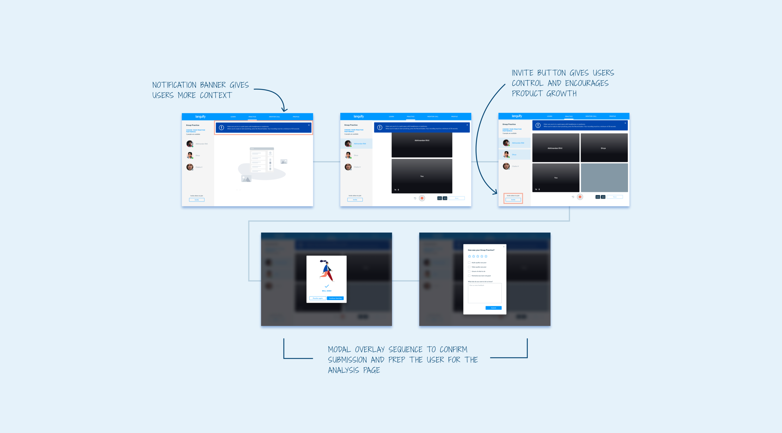
😵 PROBLEM #1
Users didn’t understand how to interact with the practice exercises.
Users didn’t know what do after a practice exercise.
💡 SOLUTION #1
Incorporate modals and buttons to make users aware of what they’re doing, what to expect next, and offer paths to move forward.

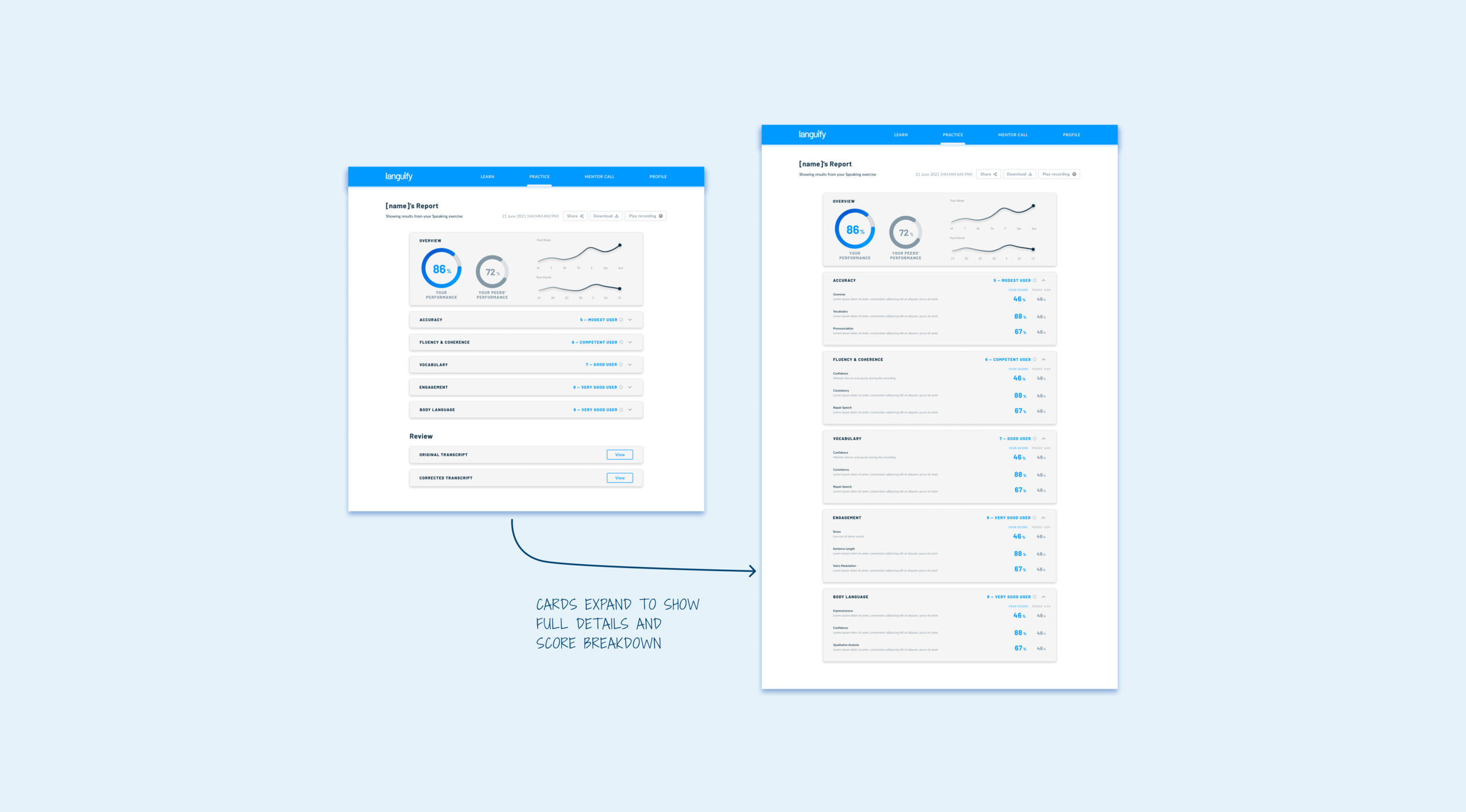
😵 PROBLEM #2
Users couldn’t understand how well they did in their practice exercises.
Language used to explain the results was too technical.
💡 SOLUTION #2
A rating scale to indicate the student’s performance level.
Visual graphs to outline their progress over time.

📝 Validate with user testing and client feedback
Present V1 of wireframes to Languify and gather feedback
Iterate
User test V2 with 5 existing users
Iterate
Present V3 to Languify and gather feedback
Iterate
Present final prototype
Insights
Data visualization for the Dashboard and Analysis screens need refining
Users liked seeing the graphs but needed more information to understand what they were seeing.
Some flows had too many buttons to click through and others were confusing
Users felt that some screens transitions could be automated and did not require their input to move on to the next screen.
Having both Dual and Group Practice modes was unnecessary
Users didn’t see a distinction between Dual and Group modes.
The Design System
Refreshing the color palette and typography
The Design System
Building the Design System
Prepping designs and facilitating handoff
We met with Languify and the incoming team to give a brief overview of what we worked on and why, provide our recommendation for next steps, transfer ownership, and answer questions.
I polished the design system and included notes to set up a handoff file for the new design team. The handoff highlighted the problem we were solving, our scope, and our research and designs.

Lessons learned
Communicate early and often with the client.
From the beginning, my team knew a thorough site refresh including desktop, mobile, and a browser extension was not possible for a 5 week timeline. We quickly mapped out the core pieces of the site that would provide the most value using user research and feedback, and set a firm timeline with milestones and deliverables. Languify had ambitious goals and we recommended next steps for nice-to-have features and advised them to bring on another team to pick up for the next phase.
Don’t leave users hanging.
Giving users options and control in choosing their paths helps them understand where they stand and what their next steps are.

